Technology Update from the Global OFN Team
Over the years we’ve been running Open Food Network, we’ve been working tirelessly to build the tools that food enterprises need to succeed. With our tiny, part time development team working remotely in the UK, Australia, Catalonia, Portugal, Philippines and France and people running food enterprises in (in alphabetical order) Argentina, Australia, Catalonia, Canada, England, France, Germany, Portugal, Scotland, South Africa, USA, and Wales (and now India and Turkey) we’re working together to build common infrastructure to power our food sovereignty!
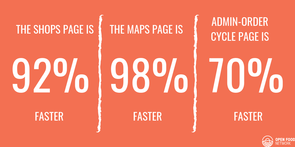
For much of this time we’ve focused on features like subscriptions, and product import. But the time came for us to spend some time focusing on some of the underlying infrastructure. We needed to make major upgrades to the performance of Open Food Network and the underlying systems that mean that Open Food Network is secure and resilient. This has taken a huge effort from the Open Food Network team over the past year, meaning that we’ve delivered fewer features than we would have liked. But we can now start to reap the rewards:

New features coming
We’ve also put some key efforts into the user experience (UX). The menu bar is now a better experience on mobile. Carts now save for later when a user logs out. A huge number of smaller, annoying things have been updated.
And we’ve made major upgrades to security. We’ve upgraded to state-of-the-art web security that makes our servers less vulnerable to attacks.
We’re very proud of this huge release that represents an enormous effort from our developers around the world!
What is coming!
We’re very excited to offer you a preview of what we’ve got coming up next:

MOBILE CUSTOMER IMPROVEMENTS
We’re making a number of changes to the customer experience in the coming weeks, all aimed at making shopping with Open Food Network from a mobile more streamlined and intuitive.
Improved UX for customers searching for your products
We’ve made some changes to the search and filter display making it easier for your customers to search for specific products in your order cycle/s and to filter their search simply when shopping.
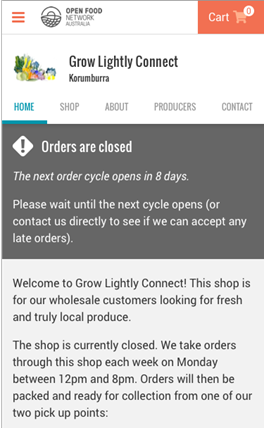
Improved UX for your customers selecting an order cycle or viewing your closed store message

- We’ve streamlined the design of your HOME and SHOP page so that your customers can select an order cycle using a simple drop-down menu if your store has multiple order cycles available.
- The closed store message is now streamlined in an edge to edge charcoal text box at the top of both the HOME, and the SHOP menus.
Make sure you’re making the most of your HOME message!
You can use this as a place to explain to new customers how to shop with you, when your order cycles open (if they’re visiting when it’s closed) and more – why not try including how to sign up to your mailing list?
MANAGING YOUR ORDERS AND STORE
- See how much is owed on each of your orders at a glance- outstanding balance due (or credit owed) is now displayed on the order index page.
- Customer Totals Report – fields added – two new columns, one for order number and one for date/time of completion.
- Alert when an order cycle is unsaved – pop-up message “Changes that you made may not be saved” will display if you navigate away from a new order cycle without saving.
- Alert when changing a shipping method – If you are changing a shipping method you will see a new warning message when you click edit with options for how to avoid affecting existing orders.
If you’d like more help with setting up a new feature, or you have a question, you can contact us on
